This dashboard is meant to be used as a tool to visualize crime by neighbourhood. For an Exploratory Data Analysis, check here.
About the implementation
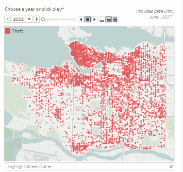
- The animated map is playable only if you download the dashboard and open it in Tableau. The animation looks like this:
Example of the animated map
-
Converting UTM to Longitude and Latitude: the original data set includes UTM coordinates. In order to map it in Tableau, I converted it to Longitude and Latitude using a spreadsheet that can be found here: UTM Conversion
-
To draw the neighbourhood's boundaries, there is a data set that contains the shapes. The data set is called Local Area Boundary. A new feature of Tableau version 10.2 is that you can import this kind of file directly. Before that, you would need to use another software to convert the shape file to coordinates.
-
Tools used in this visualization: filters, context filters, highlighter, dashboard actions, URL action, animated map, map from shapes, sparkline, time-series, table calculation (moving average), dual axis, data source join, data source filter, data extract, tooltip, calculated field to get neighbourhood's initials and other calculated fields, dimension's hierarchies
Check more about crime in Vancouver.
Comments
comments powered by Disqus